Project Details
Boutique Victorian Hotel in San Francisco
Background
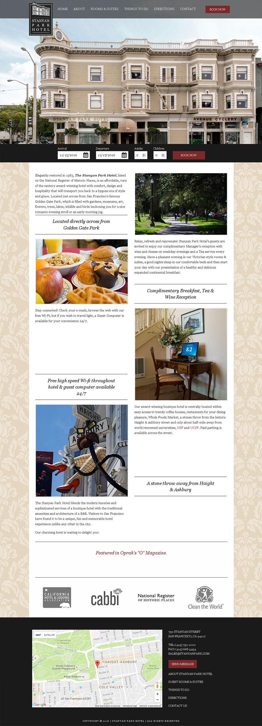
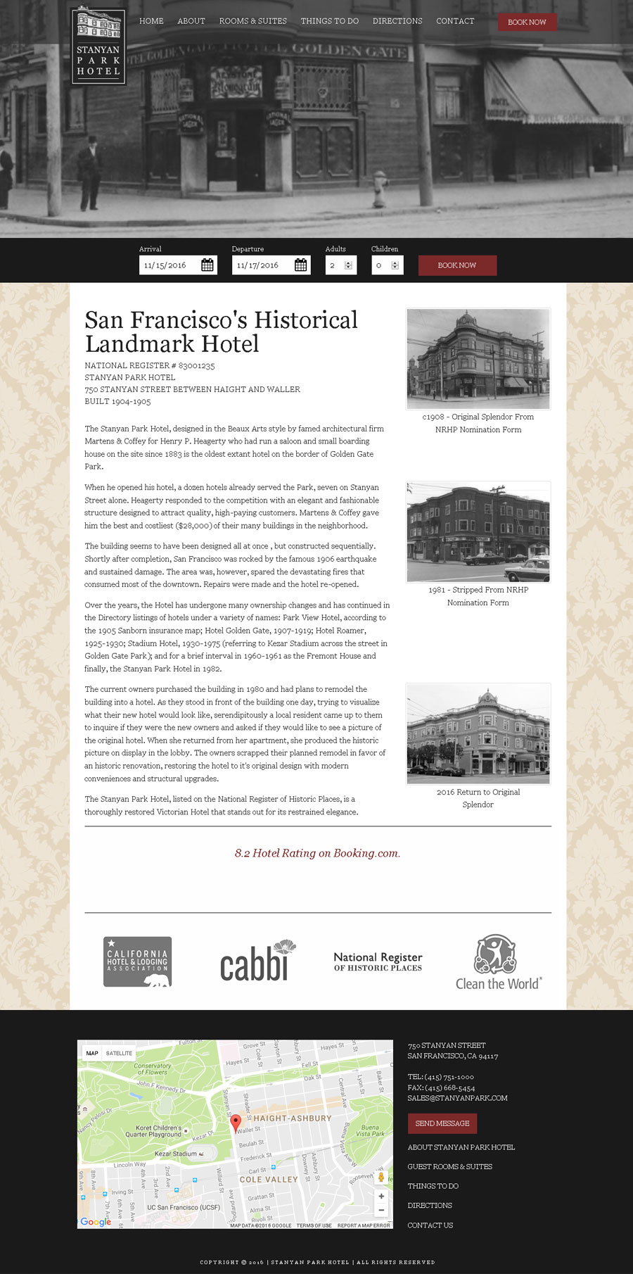
Stanyan Park Hotel is an adorable boutique hotel graciously resting across the street from Golden Gate Park. The hotel was looking to change their online appeal. They felt the old dark green color used in their brand-assets didn't suite the vibe they were looking to manifest. Through photography, colors, design patterns, and a simple user interaction, we brought their brand into modern times. Anyone with an internet connected device can easily book a night with this historic hotel.
Experience Guide
Color Pallete & Feel
Stanyan Park though old, needed to feel new. It's victorian style is timeless, yes, but the color scheme was old. The green and white scheme used on various marketing material felt disconnected from the warmer and more classic colors of the hotel and its rooms. Our inspiration for our color choices came from the hotels exterior. We went with a silky light nut brown color paired with warm red that can stand well as an accent color. Shades of black are used for content sections that need to stand alone from the rest of the aesthetic.
Experience Design
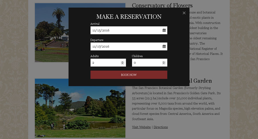
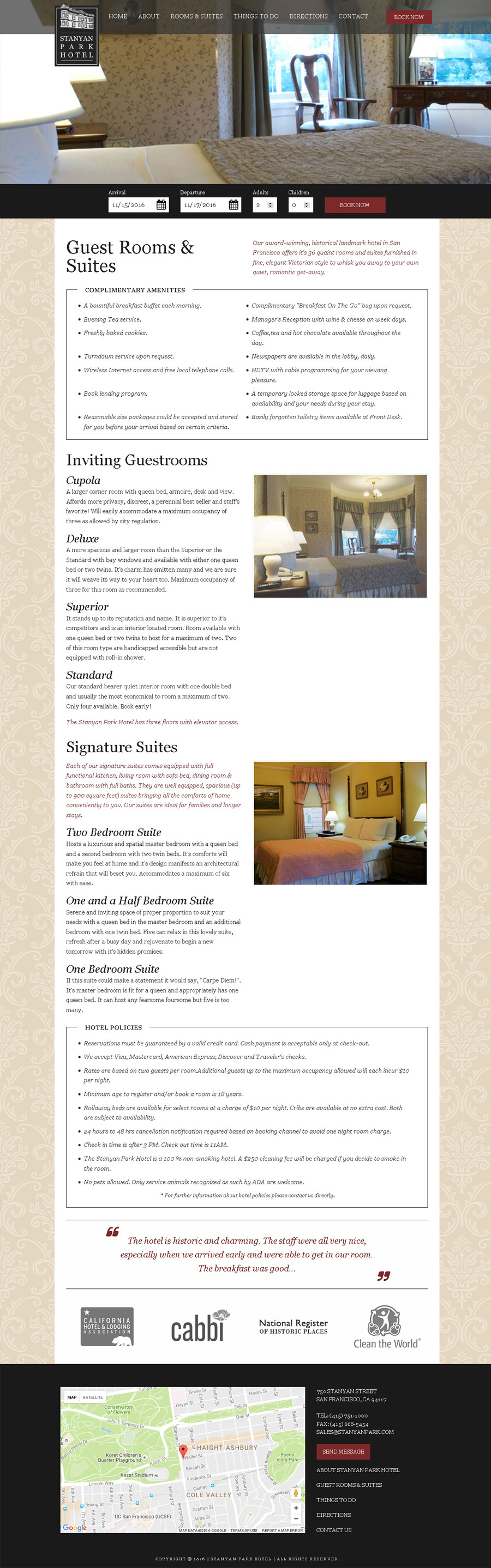
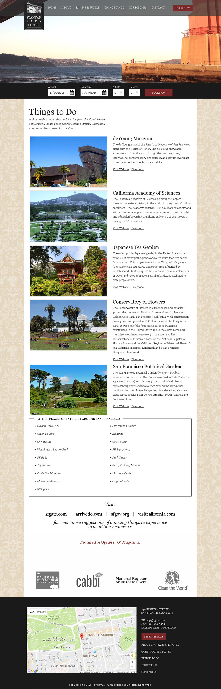
A successful hotel website meant viewers turned into hotel bookers. This meant allowing the users to easily book a room from any device. With that in mind we designed a layout that would highlight the historic beauty of the hotel and neighborhood. On the home page we presented the enticing details of booking a room with Stanyan Park Hotel. We dedicated a page to nearby attractions for patrons to visit. Another page to present the rich history of the hotel and lastly a page to view details of the rooms. From any device and during anywhere on the website, users are able to quickly book a room.
Photography
We took professional photos of the hotel and its rooms for Stanyan Park Hotel.